Publicity
Samho Development news and information

Publicity
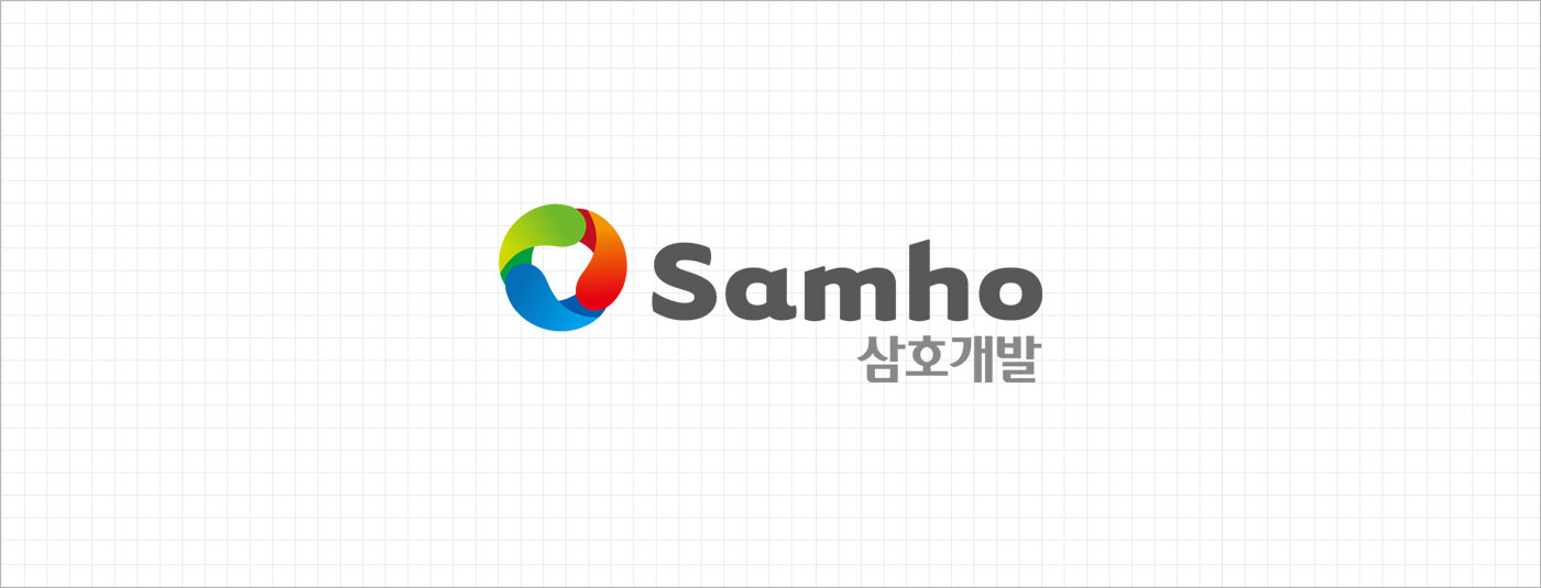
CI
CI
Basic Logotype
Slogan
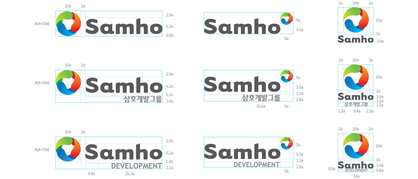
Symbol (Minimum spacing requirements)
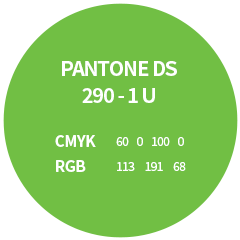
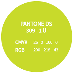
Brand Palette
Samho’s unique colour palette is not only a corporate trademark, but also an important element in the creation of our identity.
It is a visual representation of our company that consolidates and conveys our identity in a wide range of visual media.
This colour palette is printed using the 4-colour printing process (CMYK) so some slight colour variations in the logo is possible,
depending on the medium they are printed on, however our sample comes closest to the originally intended colours.
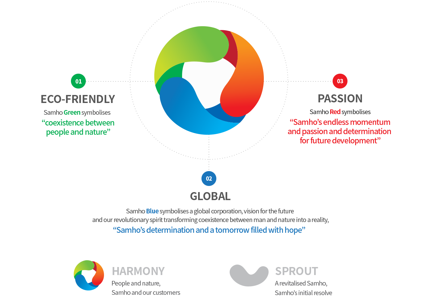
Samho Green
The green colour in the Samho logo symbolises
"coexistence between people and nature."
It encompasses our dreams of harnessing
the splendour of nature to create a beautiful earth.
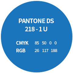
Samho Blue
The blue colour in the Samho logo symbolises
"Samho's determination and a tomorrow full of hope."
As a future-focused global company that possesses a spirit of
constant innovation, Samho makes coexistence with nature a reality.
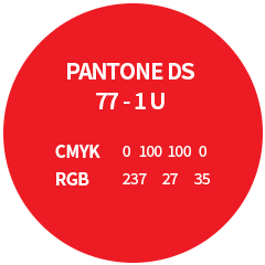
Samho Red
The red in the Samho logo symbolises “Samho’s endless drive and
determination and passion for future development.” Once we plan to
do something, our momentum and drive means we keep on working until
we gain the results that we desire, no matter what adversity and hardship
we may face. That is why we are always one step ahead of everyone else and
can confidently promise Korea a future that is brimming with hope.
Symbol Design Concept
Design concept behind
the Samho symbol
Samho and our customers, people and nature, we are all organically interconnected, influencing each other as
we coexist alongside each other. We have incorporated the shape of the earth, which simultaneously rotates on
its axis and orbits around the sun, as a visual representation of Samho's future-oriented relationships,
passion for the future and fiery determination. We have used the imagery of a seedling to symbolize our respect for
the heavens and the earth, and the value of life, and reflect our corporate philosophy of working to benefit the people.
We wanted our symbol to be a concrete representation of our forward-looking vision for the future here at Samho,
as we keep on evolving infinitely.
Symbol Mark Description
This is our official company design, which created in order to present a consistently united corporate image.
When the size of the image is increased or decreased, the size of the font and the spacing between the letters must maintain the same ratio as the original.
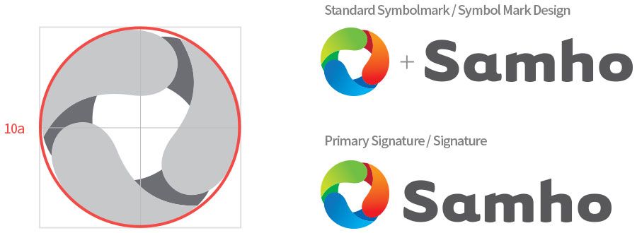
The signature is a design element that combines the symbol and logo type in the optimal proportion.
The principle behind the use of this design element is that we use it selectively, depending on the space and characteristics of the medium and our target audience.